KO
|
EN
gitlite — search
Search
#javascript
#python
#hacktoberfest
#react
#ai
#typescript
#llm
#go
#golang
#android
#machine-learning
#rust
#deep-learning
#linux
react-guify
★ 8
Open GitHub ↗
Thin wrapper around guify
Download README (.md)
Explore Similar Repositories
B-cells-scRNAseq-in-BC
:
No description available.
vue-simple-verify
:
Vue简易滑动验证组件
Animation-Challenge
:
for Behnam Mohammadi's challenge
sassConvertLess
:
sass convert to less,把目录下的所有sass文件转less文件
NeuMorphism
:
No description available.
// repository documentation
Was this content helpful?
★ 0
(0 ratings)
Select Rating:
★
★
★
★
★
Submit Feedback
Recent Feedback
×
Download README
Do you want to download the
README.md
file for
react-guify
?
Download (.md)
# react-guify    React-guify is a thin wrapper around the [simple GUI library guify](https://github.com/colejd/guify). 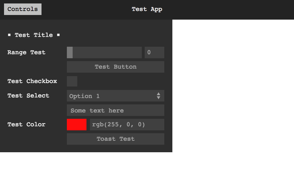 [Demo](https://codesandbox.io/s/react-guify-154rk) ### Installation ```bash #Yarn yarn add guify react-guify #NPM npm install guify react-guify ``` ### Example ```jsx function App() { const [state, setState] = React.useState(initialState) const gui = React.useRef() return ( <GuiPanel ref={gui} data={state} setData={setState} barMode="above" theme="light" > <GuiButton label="Toast" action={() => { gui.current.Toast('Current date: ' + Date.now()) }} /> <GuiText property="name" /> <GuiTitle label="Options" /> <GuiFile label="Select File" property="file" /> <GuiDisplay property="name" /> <GuiCheckbox property="checkeds" /> <GuiColor property="color" /> <GuiFolder label="Bounds Folder" open={true}> <GuiRange label="bounds" property="bounds" scale="log" onChange={value => console.log({ value })} /> <GuiSelect property="movement" options={options} /> <GuiInterval property="interval" min={5} max={70} /> </GuiFolder> </GuiPanel> ) } ``` ## Api ### Components exports React-guify creates and exports React components that allow you to structure the GUI with React nodes. You can pass all options from guify as props to these components. For now components will not respond to props update. [Read guify docs for more](https://github.com/colejd/guify/). #### Main panel - `GuiPanel`: guify main panel. In addition to the native options from guify, the panel requires two additional props: - `data`: the data object bound to components. - `setData`: the function the panel will call to update your data when values change. #### Data-bound components - `GuiCheckbox`: a checkbox - `GuiRange`: a number selector - `GuiInterval`: an interval selector - `GuiColor`: a color selector - `GuiSelect`: an option selector - `GuiText`: a free-text entry - `GuiDisplay`: displays a variable - `GuiFile`: a file selector #### Action components - `GuiButton`: a button with an action #### Organizational components: - `GuiTitle`: shows a title - `GuiFolder`: a folder grouping different components ### Toast guify has a nice toast feature that React-guify tries to implement seamlessly. The panel component will pass back a ref to you, which will include the original `gui` object created by guify. ```jsx function ToastExample() { const [state, setState] = React.useState(initialState) const gui = React.useRef() return ( <GuiPanel ref={gui} data={state} setData={setState}> <GuiButton label="Toast" action={() => gui.current.Toast('Hello from Toast')} /> </GuiPanel> ) } ``` --- ### Todo List - [ ] Proper mounting and unmounting - [ ] Updating props on the fly
