KO
|
EN
gitlite — search
Search
#typescript
#ai-agents
#ai
#dsh-plugin
#deepseek-harness
#open-source
#cli
#claude-code
#codex
#developer-tools
#react
#windows
NinePatch
★ 23
Open GitHub ↗
Nine Patch PNGs for VB6
Download README (.md)
Explore Similar Repositories
TenPatch
:
An alternative to libGDX's 9patch implementation.
nine-patch-js
:
⛏️ Scale a nine-patch image using JavaScript's canvas.
gradle-android-9patch-plugin
:
Create 9patch from normal PNG
// repository documentation
Was this content helpful?
★ 0
(0 ratings)
Select Rating:
★
★
★
★
★
Submit Feedback
Recent Feedback
×
Download README
Do you want to download the
README.md
file for
NinePatch
?
Download (.md)
## NPPNG Nine Patch PNGs for VB6 ### Description NPPNG project includes `cNinePatch.cls` for 9-patch parsing/handling and `ctxNineButton.ctl` custom user-control for transparent animated buttons with states based on 9-patches. ### Source usage Just include `src/cNinePatch.cls` in your projects to be able to load and draw 9-patches in user-defined sizes. Add `src/ctxNineButton.ctl` and `src/mdNineButton.bas` for the transparent windowless button control, with states based on nine-patches. In `ctxNineButton` you can set conditional compilation constant `ImplHasTimers` to `False` to disable control state-transition animations. In this case `src/mdNineButton.bas` will not be depended on anymore and the control becomes self-contained in `src/ctxNineButton.ctl`. ### Preset `ctxNineButton` styles | Type | Style | Preview | | --------------- | -------------------------- | ----------------------------------------- | | Buttons | Simple buttons || | | `ucsBtyButtonDefault` | 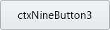 | | | `ucsBtyButtonGreen` |  | | | `ucsBtyButtonTurnRed` |  | | Flat Buttons | Flat buttons based on bootstrap || | | `ucsBtyFlatPrimary` |  | | | `ucsBtyFlatSecondary` | 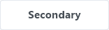 | | | `ucsBtyFlatSuccess` |  | | | `ucsBtyFlatDanger` |  | | | `ucsBtyFlatWarning` |  | | | `ucsBtyFlatInfo` |  | | | `ucsBtyFlatLight` | 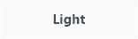 | | | `ucsBtyFlatDark` |  | | Outline Buttons | Outline buttons based on boostrap || | | `ucsBtyOutlinePrimary` |  | | | `ucsBtyOutlineSecondary` |  | | | `ucsBtyOutlineSuccess` |  | | | `ucsBtyOutlineDanger` |  | | | `ucsBtyOutlineWarning` |  | | | `ucsBtyOutlineInfo` | 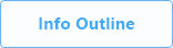 | | | `ucsBtyOutlineLight` |  | | | `ucsBtyOutlineDark` |  | | Cards | Static cards that can be owner-drawn with information || | | `ucsBtyCardDefault` | 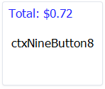 | | | `ucsBtyCardPrimary` | 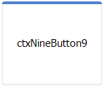 | | | `ucsBtyCardSuccess` | 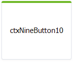 | | | `ucsBtyCardPurple` | 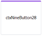 | ### Supported button states | State | Description | | -------------------- | ----------- | | `ucsBstNormal` | Normal state | | `ucsBstHover` | Optional mouse hover. Otherwise `ucsBstNormal` is used | | `ucsBstPressed` | Optional mouse pressed. Otherwise `ucsBstHover` is used | | `ucsBstHoverPressed` | Optional mouse pressed over the control. Otherwise `ucsBstPressed` is used | | `ucsBstDisabled` | Optional disabled state | | `ucsBstFocused` | Optional focus rectangle which is composited before current state | Each state can have a different 9-patch image, text and shadow properties. ### Supported state customizations | Property | Description | | --------------------- | ----------- | | `ButtonImageArray` | Nine-patch image as byte array | | `ButtonImageOpacity` | Image transparency incl. composited text and shadow | | `ButtonTextFont` | Text font | | `ButtonTextFlags` | Text alignment and wrapping | | `ButtonTextColor` | Text color | | `ButtonTextOpacity` | Text transparency on image before applying image transparency | | `ButtonTextOffsetX` | Additional text horizontal offset after alignment | | `ButtonTextOffsetY` | Additional text vertical offset after alignment | | `ButtonShadowColor` | Text shadow color | | `ButtonShadowOpacity` | Text shadow transparency on image | | `ButtonShadowOffsetX` | Shadow horizontal offset from text | | `ButtonShadowOffsetY` | Shadow vertical offset from text | ### Global customizations | Property | Description | | ------------------- | ----------- | | `AnimationDuration` | Duration of state transition (in seconds) | | `Opacity` | Global control transparency | | `Enabled` | Uses disabled state settings to paint control |
