KO
|
EN
gitlite — search
Search
#javascript
#python
#hacktoberfest
#react
#ai
#typescript
#llm
#go
#golang
#android
#machine-learning
#rust
#deep-learning
#linux
a3-chaoyu-aniket
★ 14
Open GitHub ↗
Global Terrorism Visualization
Download README (.md)
Explore Similar Repositories
parseuri
:
Module for parsing URI's in engine.io-client
SWFTools-Core
:
SWF decompiler and basic player
node-sqlcipher
:
SQLcipher binding for NodeJS
rack-timing
:
Such timestamps for your Rails app rack stack. wow
lazybone-templates
:
My Lazybone Templates
// repository documentation
Was this content helpful?
★ 0
(0 ratings)
Select Rating:
★
★
★
★
★
Submit Feedback
Recent Feedback
×
Download README
Do you want to download the
README.md
file for
a3-chaoyu-aniket
?
Download (.md)
Global Terrorism Visualization =============== :arrow_right: [ **RUN THE DEMO HERE**](http://cse512-14w.github.io/a3-chaoyu-aniket/) :arrow_left: 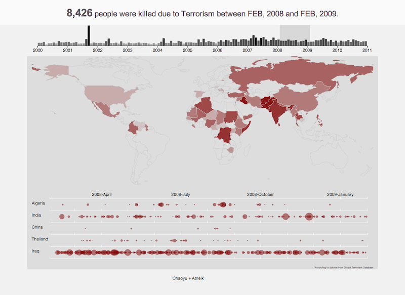 ## Running Instructions Access our visualization [**HERE**](http://cse512-14w.github.io/a3-chaoyu-aniket/). **OR** download this repository and run ```python -m SimpleHTTPServer 9000``` at the root. Then access the visualization from <http://localhost:9000/> using your favorite web browser. ## The Dataset The visualization depends upon dataset acquired from [Global Terrorism Database](http://www.start.umd.edu/gtd) (GTD, University of Maryland). >It is currently the most comprehensive unclassified data base on over 113,000 terrorist events, occurred between 1970 and 2012 in the world. Each event consists information on the date, location, number of people killed and injured, weapons used, intention, group or individual involved, target, summary, cites, etc. The dataset was cleaned before being directly used. Many required values were `null` or inconsistent. For example, some of the 3 Letter country codes from the database were not matching to that in the [Datamap](http://datamaps.github.io/) object. ## Visualization Contributors **_Chaoyu Yang_** * Ruby code for data cleaning * Implementation of Brushed time scale * on Brushed event * Individual Country visualization * Page styles * Responsive view * World Map Optimization **_Aniket Handa_** * Dataset Exploration * World Map implementation and brush integration * Country selection * Colors ##Dependencies * [D3.js](http://d3js.org/) * [Datamap](http://datamaps.github.io/) * [underscore.js](http://underscorejs.org/) ##Interactions The Visualization focuses on discovering important trends and events that shaped the history due to Terrorism. It also tries to make user conscious about the number of unnecessary lives lost due to these unfortunate events. We try to accomplish this by showing multiple views of the large dataset - * The Global Map view - Shows the world map with color encoded countries according to number of killings over the selected period of time. * Country Wise view - Shows circle graphs over the selected period of time. * Brushing tool - Shows a bar graph of total killings in every month. The purpose of all these three views is different. The Map view shows the high level effect on countries due to terrorism, whereas the Country wise view concentrates on comparison, ordering, discovering trends of events between two or more countries, and also it facilitates finding the event which caused the mishap. While these two views focus over a period of time, the Brushing tool helps constantly see the visualization over the full period. It also helps in controlling the other two views. The visualization features basically three interaction techniques: _1. Brush:_ To brush and link multiple views we use a timeline as a background, which starts from first day of Jan, 2000 to Jan, 2011. It supports * Expansion of the current selection in either direction, * Dragging of the span over the timeline, and * Clicking outside the span selects that particular month. _2. Select:_ To afford comparison and trend discovery between event happenings in two or more countries users can select countries by clicking them on the world map. This adds the country to the country wise view of the visualization. _3. Hover:_ Details on demand - Hovering over a country in the World Map reveals the total number of killings in that country over the period. Also, hovering over a data point in the country wise view reveals more information about the event w.r.t. to the data point. ## Design Process We started off with data search and found many datasets which called our attention. But before finalizing on one we briefly explored all of them using Tableau. ####Exploration * World Map representing countries with more killings (nkill) by more red. 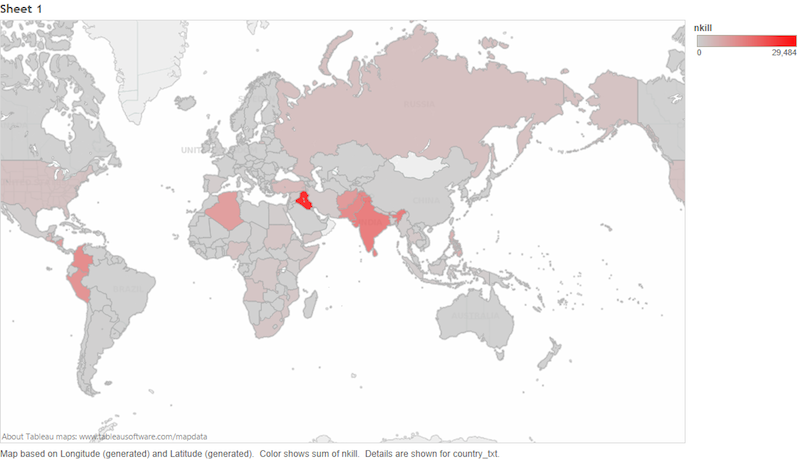 * A time stream representing the trend  * Heat Map of all countries w.r.t. to time, colored according to number of killings. 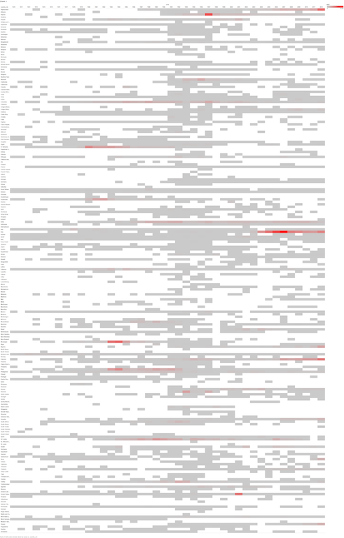 * Bubble Chart 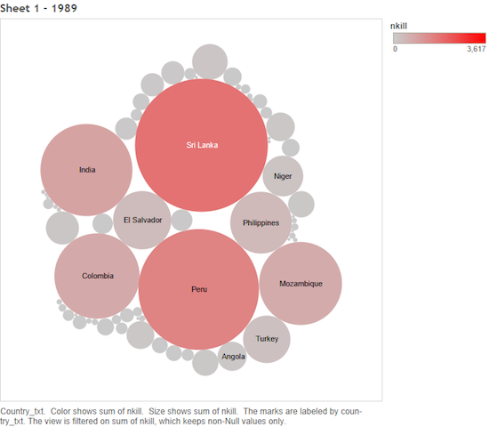 While exploring these charts using Tableau we also simulated them using pages year wise to evaluate various interactions possible. ####Sketching * During Brainstorm 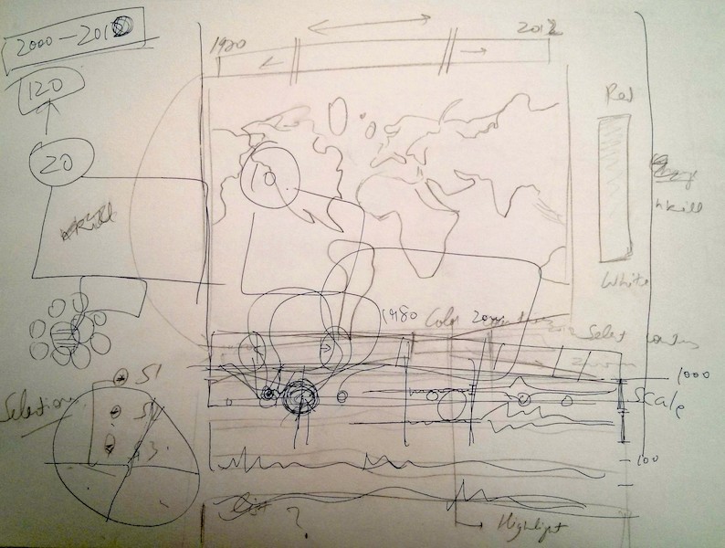 * Final sketch before we started coding 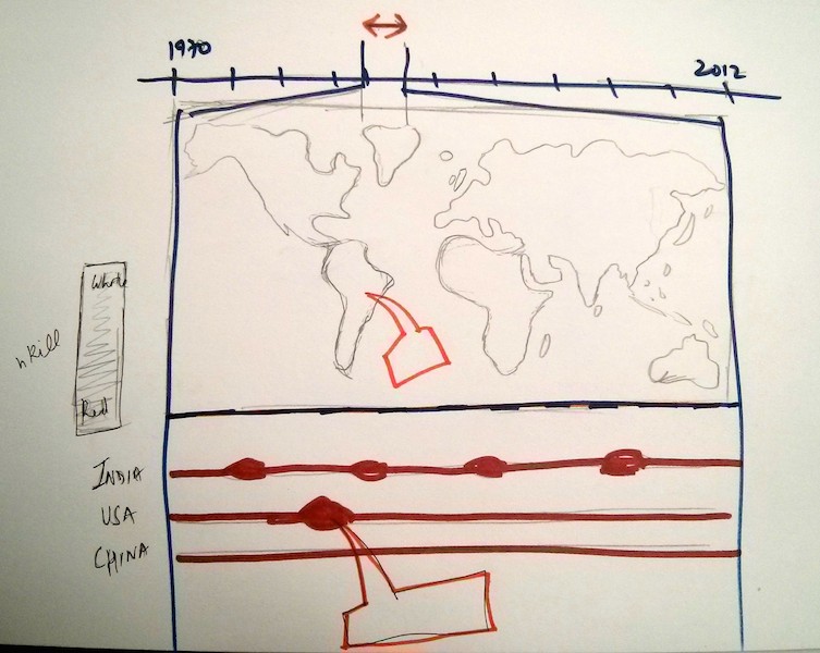 The top portion is a timeline wherein one can select the months from 2000 to 2010. It is used to brush below two visualizations. It affords all the interactions mentioned above. #### Changes between Storyboard and the Final Implementation There are not any significant changes between the final sketch and the final implementation. Though there were some stubble changes in placement of various elements, the colors, the scale used. But, the overall interaction, views and underlining objective remained the same. * Its hard to sketch colors and exactly understand how they will be perceived without an actual running prototype. We didn't consider the use of log scale for color encoding, until we saw the running visualization. * We first envisioned the country wise visualization to be similar to time stream from Tableau (above), but we ended up plotting translucent circles with size dependent upon killings to represent each event.