KO
|
EN
gitlite — search
Search
#typescript
#ai-agents
#ai
#dsh-plugin
#deepseek-harness
#open-source
#cli
#claude-code
#codex
#developer-tools
#react
#windows
bignumber-card
★ 144
Open GitHub ↗
No description available.
Download README (.md)
Explore Similar Repositories
fullstack-apollo-react-boilerplate
:
💥A sophisticated Apollo in React boilerplate project.
starter.dev
:
A collection of kits to help bootstrap your next project.
scorch
:
scorch is a deep learning framework in Scala inspired by PyTorch
parser-js
:
AsyncAPI parser for Javascript (browser-compatible too).
lerna-learning
:
基于Lerna管理packages的Monorepo项目最佳实践
// repository documentation
Was this content helpful?
★ 0
(0 ratings)
Select Rating:
★
★
★
★
★
Submit Feedback
Recent Feedback
×
Download README
Do you want to download the
README.md
file for
bignumber-card
?
Download (.md)
# Big number card A simple card to display big numbers for sensors. It also supports severity levels as background. 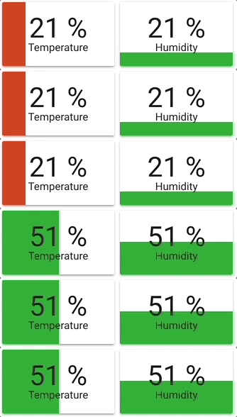 **Options** | Name | Type | Default | Description | ---- | ---- | ------- | ----------- | type | string | **Required** | `custom:bignumber-card` | title | string | optional | Name to display on card | scale | string | 50px | Base scale for card: '50px' | entity | string | **Required** | `sensor.my_temperature` | attribute | string | optional | the entity attribute you want to display e.g. `current_temperature`. The entity state will be shown if not defined. | min | number | optional | Minimum value. If specified you get bar display | max | number | optional | Maximum value. Must be specified if you added min | color | string | `var(--primary-text-color)` | Default font color. Can be either hex or HA variable. Example: 'var(--secondary-text-color)' | bnStyle | string| `var(--label-badge-blue)` | Default bar color. Can be either hex or HA variable. Example: 'var(--label-badge-green)' | from | string | left | Direction from where the bar will start filling (must have min/max specified) | severity | list | optional | A list of severity objects. Items in list must be ascending based on 'value' | hideunit | boolean | optional | hide the unit of measurement if set to true. If absent, unit of measurement will be shown | noneString | string | optional | String to use for value if value == None | noneCardClass | string | optional | CSS class to add to card if value == None | noneValueClass | string | optional | CSS class to add to value if value == None | round | int | optional | Number of decimals to round to. (If not present, do not round.) #### Severity object | Name | Type | Default | Description | ---- | ---- | ------- | ----------- | value | number | **Required** | Value until which to use this severity | bnStyle | string | **Required** | Color of severity. Can be either hex or HA variable. Example: 'var(--label-badge-green)' | color | string | `var(--primary-text-color)` | Font color of the severity. Can be either hex or HA variable. Example: 'var(--secondary-text-color)' ### WARNINGS - Make sure you use ascending object values to have consistent behaviour - Values are the upper limit until which that severity is applied - Note there is a **breaking change** with this release. In order to add the flexibility of using [card-mod](https://github.com/thomasloven/lovelace-card-mod) styling, the `style` configuration options have been changed to `bnStyle`. **Example** ```yaml - type: custom:bignumber-card title: Humidity entity: sensor.outside_humidity scale: 30px from: bottom min: 0 max: 100 hideunit: true color: '#000000' bnStyle: 'var(--label-badge-blue)' severity: - value: 70 bnStyle: 'var(--label-badge-green)' - value: 90 bnStyle: 'var(--label-badge-yellow)' - value: 100 bnStyle: 'var(--label-badge-red)' color: '#FFFFFF' ``` ### Handling None values If your sensor may result in `None` (for instance if it is offline), you may wish to handle that separately. Here is an example, which uses [card-mod](https://github.com/thomasloven/lovelace-card-mod) to add special styling for the `None` case. ```yaml - type: custom:bignumber-card title: Humidity entity: sensor.outside_humidity scale: 30px from: bottom min: 0 max: 100 color: '#000000' bnStyle: 'var(--label-badge-blue)' severity: - value: 70 bnStyle: 'var(--label-badge-green)' - value: 90 bnStyle: 'var(--label-badge-yellow)' - value: 100 bnStyle: 'var(--label-badge-red)' color: '#FFFFFF' noneString: Offline noneCardClass: none-card-class noneValueClass: none-value-class style: | .none-card-class { background-color: yellow; } .none-value-class { font-size: 22px !important; } ```
